

What is a color palette?
If you’re ready to establish or update a digital presence for your business, one of the most important things for you to decide is the combination of colors–the color palette–you will use for your website, company logo, social media profiles, business cards, and any merchandise you’d like to distribute. Using the same colors for all of these things will help you develop brand recognition, and brand recognition will help your business succeed. Some people give a color palette little thought; they just throw a few of their favorite colors together and call it good. The Ducimus Digital Solutions team would like to help you avoid that mistake, so we’ve put together some information that will help you choose your brand’s color palette carefully. Believe it or not, colors speak, and they can either attract or repel potential customers.
The Emotional Impact of Color
Colors send messages to the brain. People who view the things that represent your brand probably won’t consciously process it, but all of the unified items that represent your brand will leave viewers with a feeling, and that feeling is largely controlled by the colors you use. Whether potential customers realize it or not, colors influence the way they perceive and relate to your brand, and the thought process that determines whether or not they buy your goods or services. Combining colors without thought can cause viewers to become disinteresed, or worse, agitated, but paying careful attention to your color choices can create feelings that will attract the potential customers you need to help your business succeed.
Color as a Language
Because the colors in your logo and on your website will play a major role in the subconscious first impression of anyone who sees them, it is important to choose colors that will create the impression you want to make. It’s also important for you to understand who your target audience is, and what they are looking for when they are seeking what you have to offer. If you think of color as a language, it becomes obvious that you need to know what language your target audience speaks before you try to speak to them. If the people who are most likely to buy your product are looking for adventure and rugged dependability, you will not be best served by choosing colors that convey tenderness and gentle nurturing.

Know Your Target Audience
Take some time to determine what appeals to the people who are looking for what your business has to offer. Do they need motivation or calming? Are you more likely to appeal to their sense of adventure, or their sense of structure? Are they more interested in nature or technology? Knowing the needs and preferences of your potential customers will help you know what image you need to project in order to be successful in your field.
Use Color to Establish Your Desired Image
The next thing you need to consider is the image you want to project. What drives your company? What do you stand for? What kind of company to you aspire to be? What are your best assets? Beyond goods and services, what does your company have to offer your consumers? If quality is at the heart of your brand, you will want to use colors that speak of quality. If your brand is all about compassionate service, you need to use colors that make people think of compassion. If your brand is centered in nature and conservancy, you will want to use earth-centered colors.
Once you decide what image you need to project to be successful and what image you want to create to be true to your brand, you are ready to use the language of color to say what you need and want to say.
Every Color Has Something to Say
Colors have both positive and negative properties that should be considered. When it comes to color, too much of a good thing can create an impression that is opposite to the one you’re trying to make.
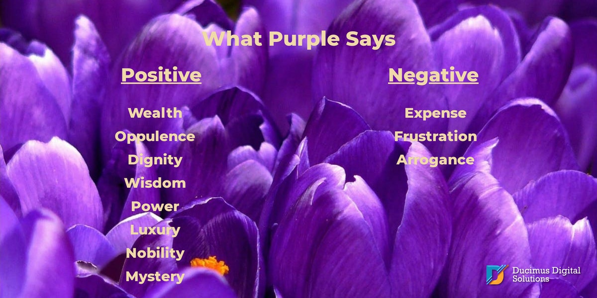
Purple
A great example of this is the color purple. Purple is the color of wealth and opulence, but it can also convey arrogance and expense. Using too much purple can leave your audience with a sense of frustration and the impression that you think your product is worth much more than its actual value. Purple is a powerful color and should be used with care.
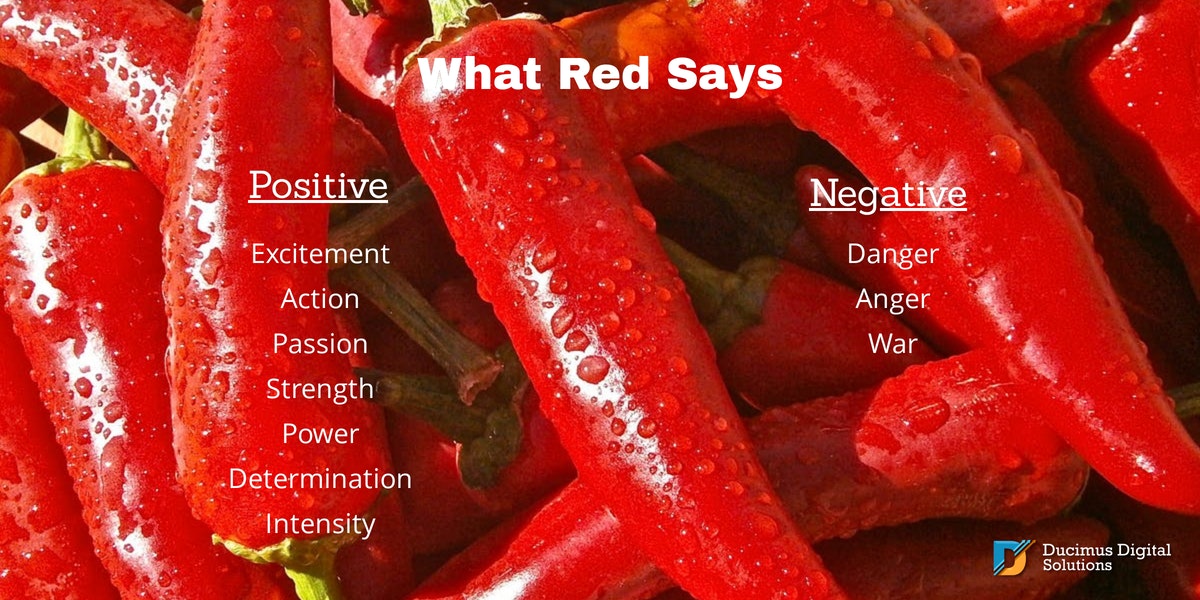
Red
Another color that should be used wisely is Red. Red is perhaps the most intense color, denoting passion, strength, excitement, energy, and action. It is also used to express anger. It is a color of power, but also of war and danger.
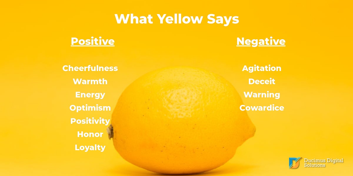
Yellow
Yellow is a color of sunshine, joy, warmth, and optimism. But this bright, happy color is not without its negative side. It can also indicate cowardice, and too much of it can be agitating.
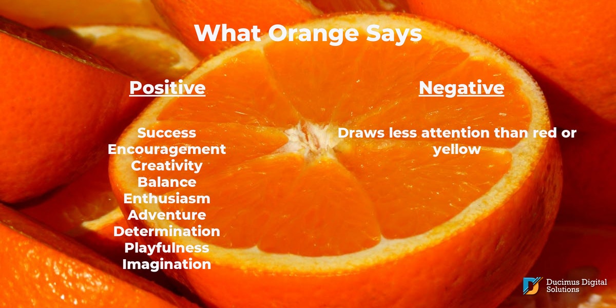
Orange
A successful combination of the warmth and joy of yellow and the power and excitement of red is orange. It can bring a sense of fun and playfulness to your brand because orange is a color of creativity and enthusiasm. It’s not all fun and games, though, it also embodies a sense and encouragement and success. It doesn’t draw as much attention as red or yellow, but it can still communicate energy and motivation.
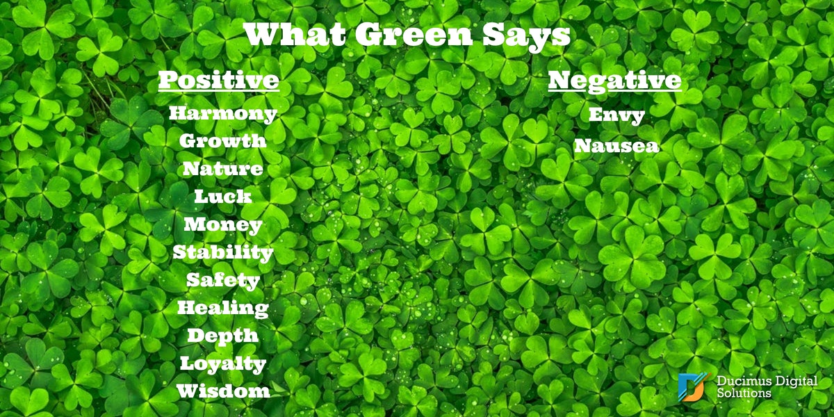
Green
Green is the color of nature and can express health, vitality, fertility, and growth. It is also a calming color than can give a sense of safety, harmony, healing, endurance, and wisdom. It is the color of money, and one of the colors of the ocean. It can imply loyalty, stability, and truth. Perhaps green is the color of envy because there is so much to envy about the many positive qualities green can convey.
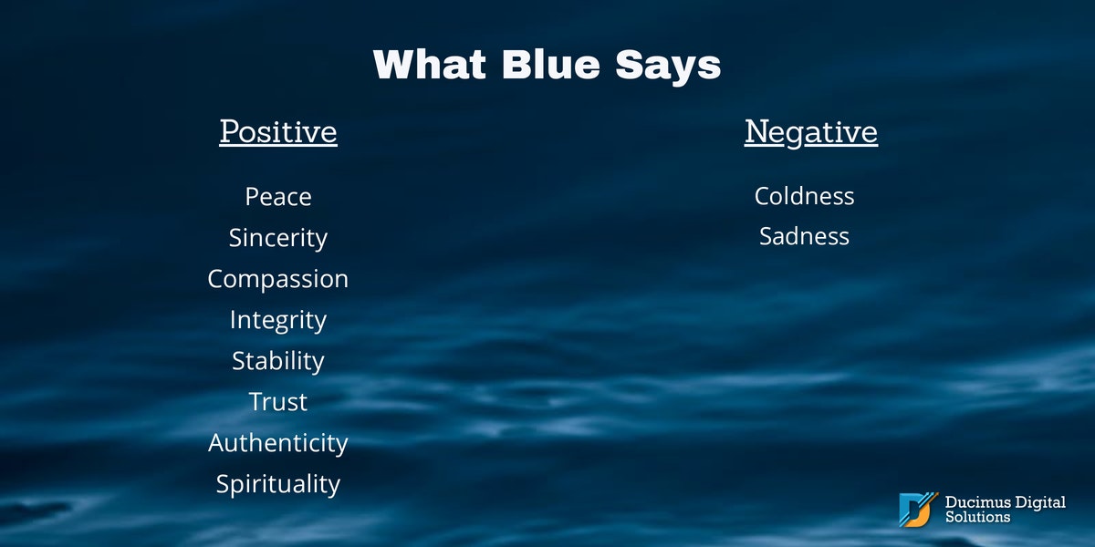
Blue
Another color with many positive connotations is blue. Blue embodies the soothing properties of water and air. It can inspire feelings of peace, serenity, and harmony. It means dependability, stability, integrity, compassion, sincerity, and authenticity. Blue can be cold and sad, but, if used properly, the negative feelings that blue can bring to mind can be avoided.
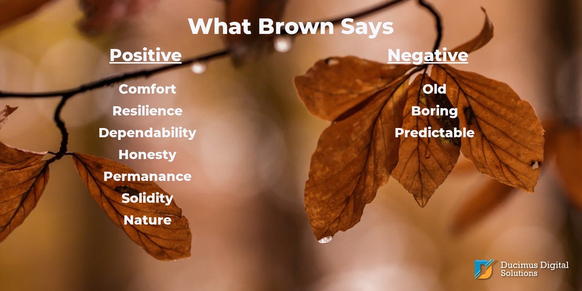
Brown
If you want to encourage feelings of solidity and dependability, brown may be an important element in your color palette. Like green, brown is a color of nature, and it denotes the honesty, comfort, and permanence of the earth. But, it can also seem old, boring, and predictable.
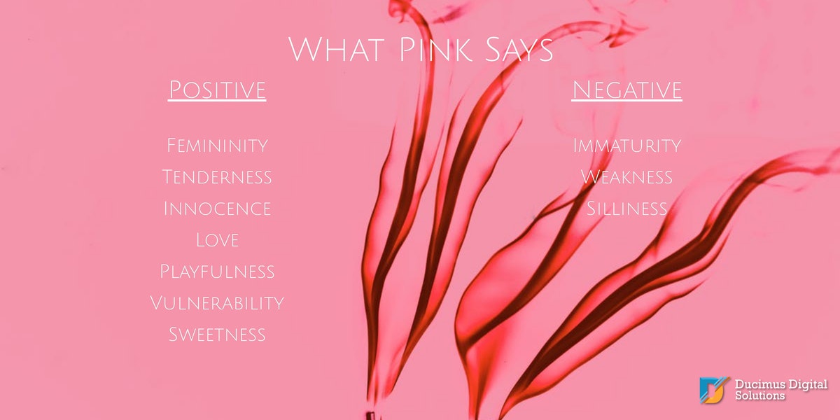
Pink
Pink is the color most often tied to femininity and tenderness. It can also bring to mind innocence, playfulness, vulnerability, and love. Pink can also seem weak, immature, and cloyingly sweet.
Black, White, and Gray
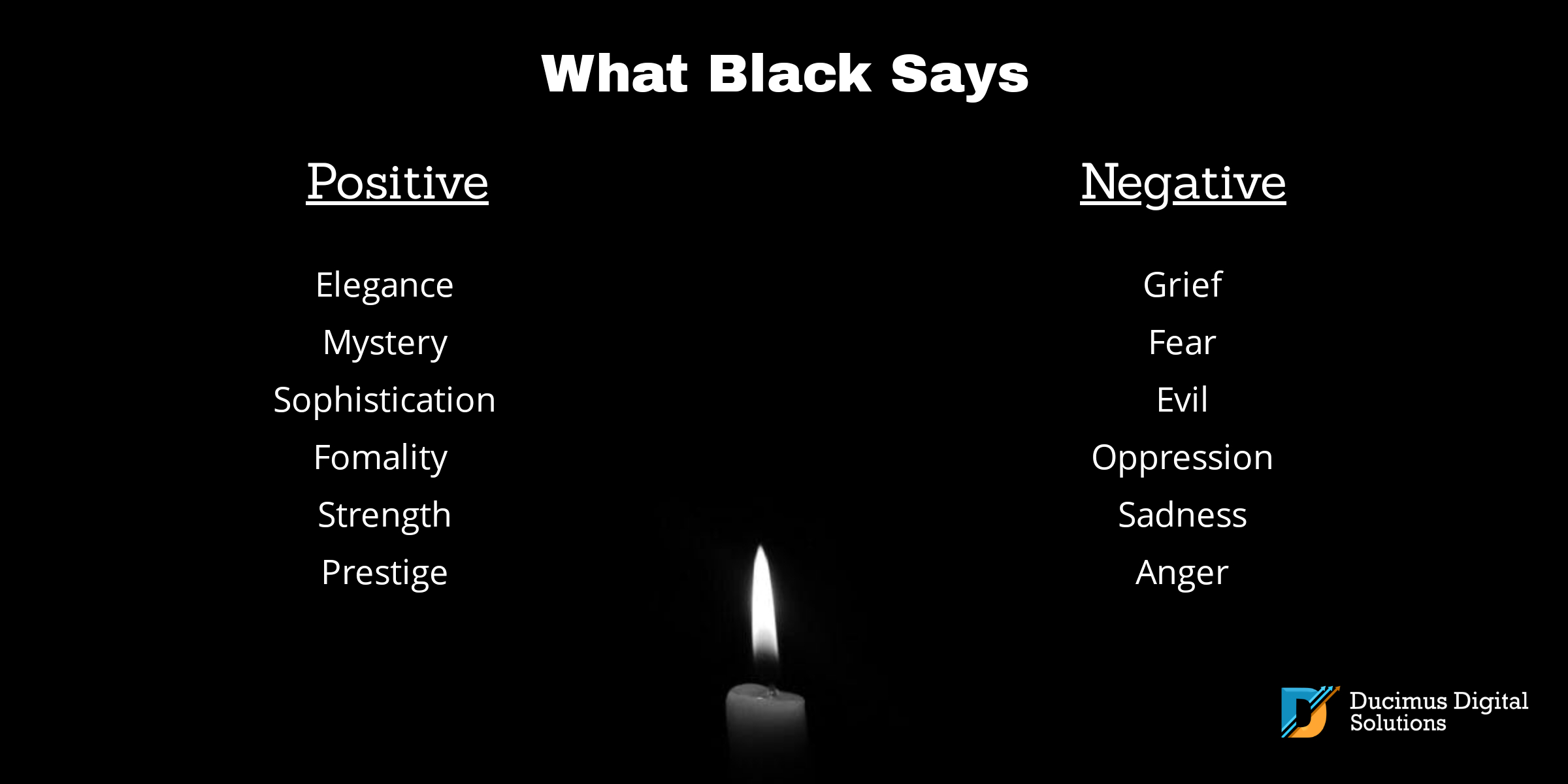
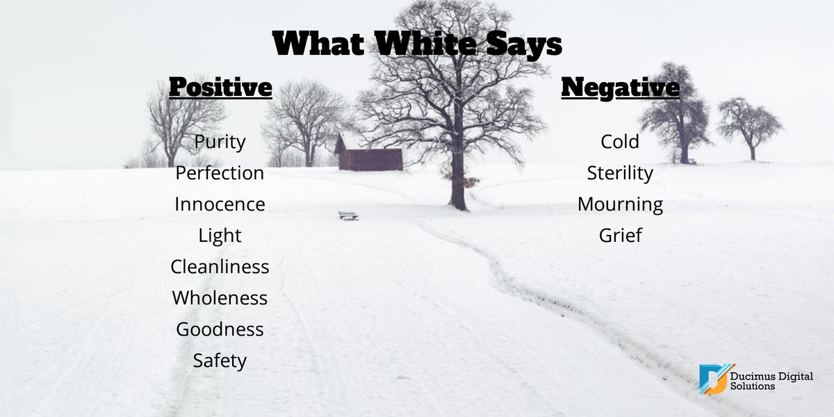
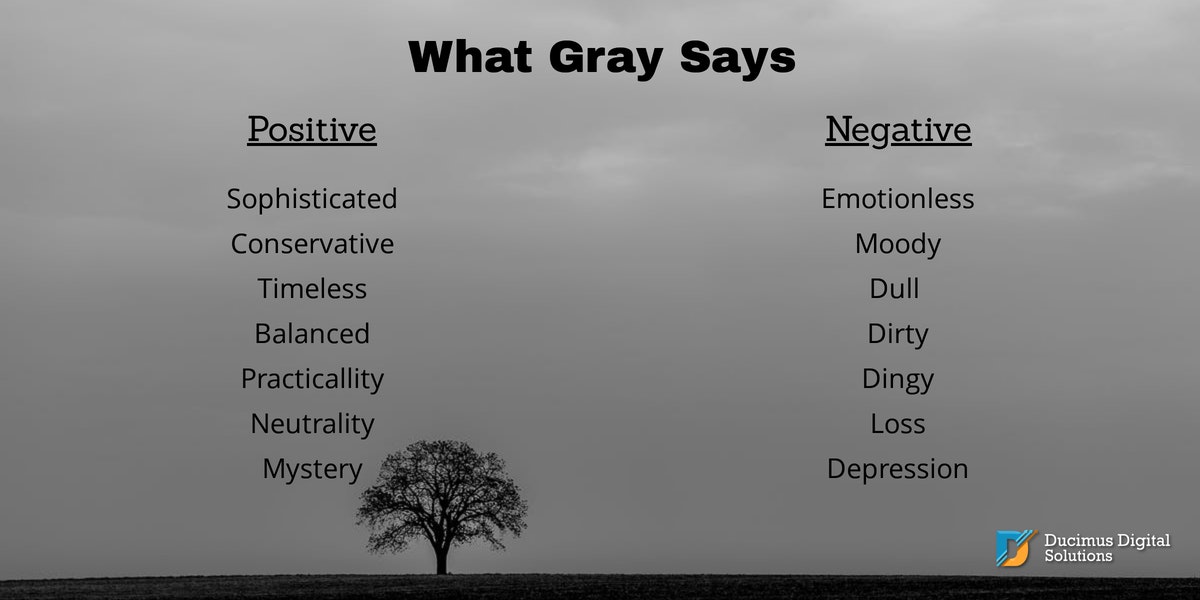
Though black, white, and gray each stir emotions in their own way, they are most often used as background or text colors. Perhaps this is because too much of any of these three colors can cause problems in perception and readability. Though black can signify elegance and power, it can also be a strong reminder of grief and fear. White can symbolize purity and perfection, but it can also mean coldness and sterility, and, in some countries, it is a color of grief. Gray can indicate balance and calm, or dirtiness and discouragement. While black, white and gray can be used together in stunningly powerful ways, they are primarily used to accent more vibrant palettes and to aid in readability.
From Emotion to Science
With an understanding of the psychology behind the many colors you can use, and a knowledge of both who you are as a brand and what your target audience hopes to find, you are almost ready to create a color palette that will speak without words to the hearts and minds of your target audience in a pleasing and effective way. Now you need to understand how to put the colors you choose together in a way that is scientifically proven to please the eye.
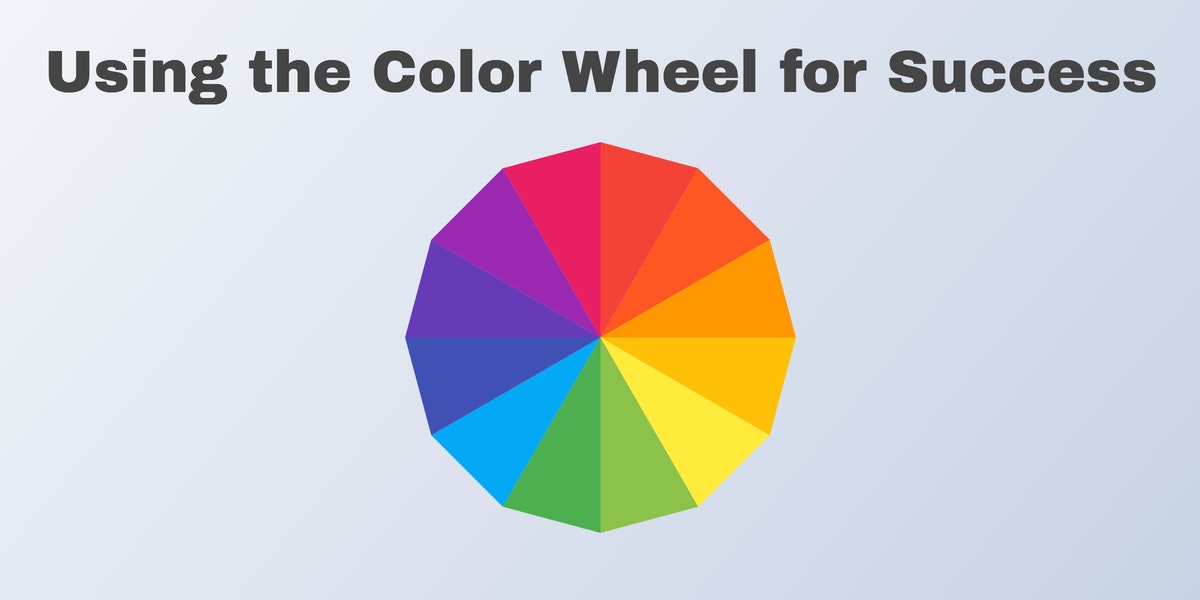
Color Harmony Rules
Color theory is a very detailed subject that experts spend a lifetime mastering, but the fact that you don’t have time to become a color theory expert doesn’t have to keep you from creating your own color palette for your brand. There are a few basic rules you can use to create a color scheme that is pleasing to you and the people who explore your brand. A brief overview of the most traditional color harmony rules will help you know what will work best for you.
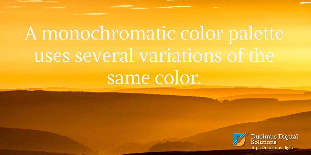
Monochromatic
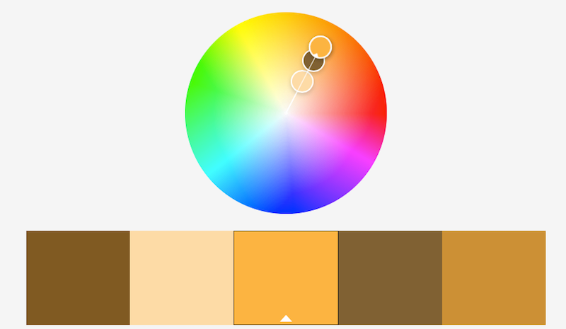
A monochromatic color palette is built by choosing several colors that lie in a straight line on the color wheel. When done well, it looks clean and unified, and the effect is often stunning. The monochromatic color scheme is a good way to go if there’s one primary message you would like to convey to potential customers. A monochromatic palette of greens would work well for a company whose primary focus is nature. A palette of yellows would be a good way to convey energy and joyfulness.
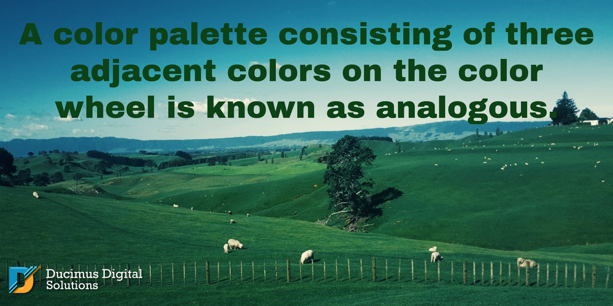
Analogous
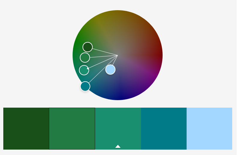
Analogous color combinations are often found in nature. This palette can be very pleasant and even soothing. It is created by choosing three colors which are next to each other on the color wheel such as orange, yellow-orange, and yellow or blue, blue-green and green.
Triadic
A triadic color palette starts with three colors spaced equally apart on the color wheel, like red, yellow, and blue or purple, green, and orange-yellow. If done well, it can be visually interesting and bring a sense of balance to your brand. Triadic color schemes are often bright, energetic and bold, and could work well for you if your brand is a brand of action.

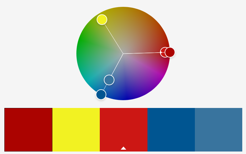
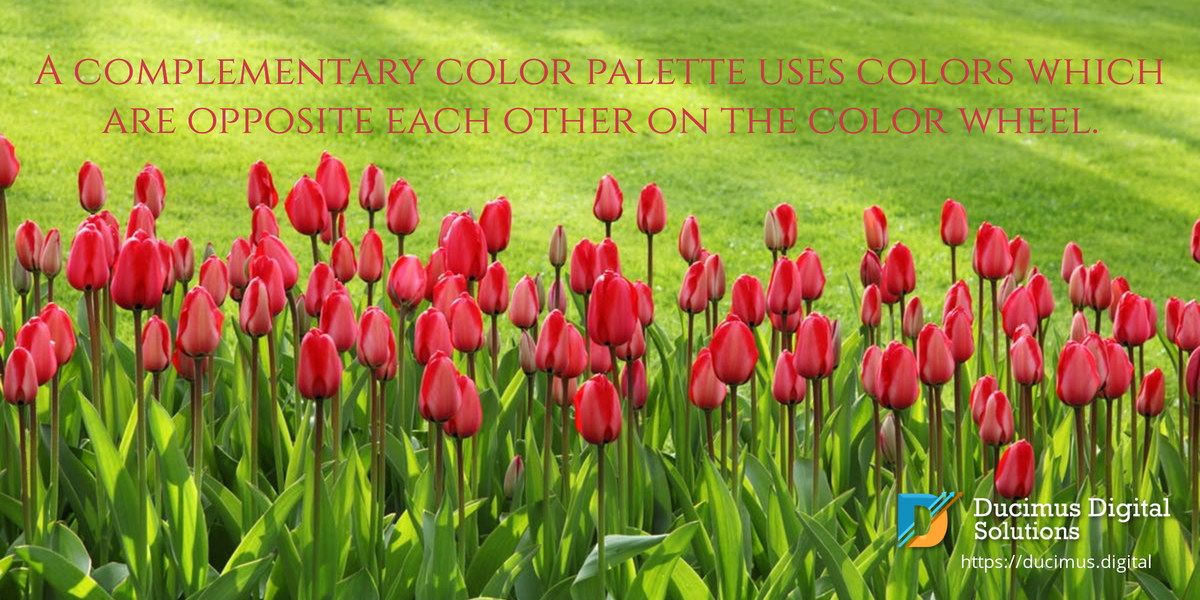
Complementary
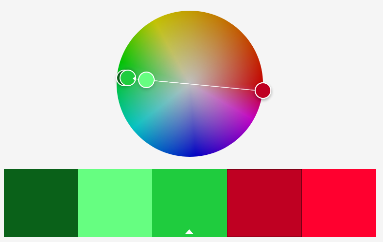
Complementary colors are colors that are opposite one another on the color wheel and provide the most visual contrast.
Split Complementary
The Split Complementary rule uses a base color plus the two colors on either side of the base color’s complementary color. For example, if you use green as your base color, you would also include red-violet and red-orange in your palette. To be visually appealing, the colors should have varying degrees of intensity; using colors with the same level of brightness can be irritating.

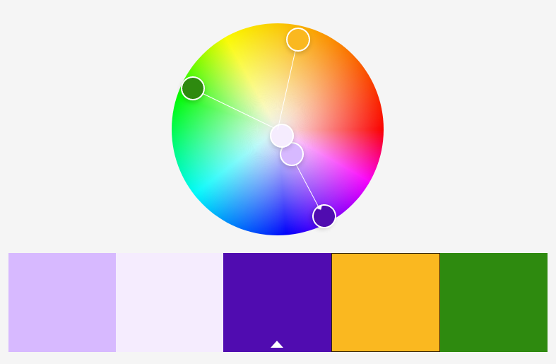
Tetradic
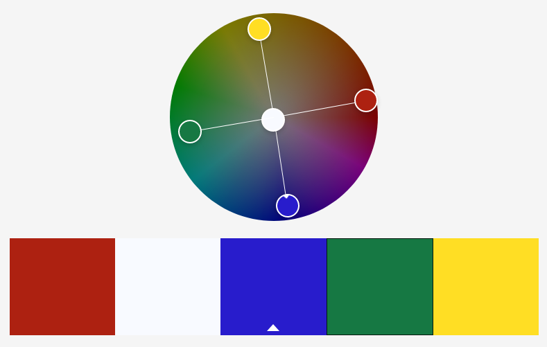
A tetradic palette is possibly the most risky of all of the traditional color harmony tricks, but big risks can sometimes result in big rewards. Tetradic palettes use two sets of complementary colors. They can be, but don’t necessarily have to be, four colors spaced equally apart on the color wheel (also know as a square color palette). Examples of tetradic palettes include red paired with green plus yellow paired with violet or blue paired with orange plus blue-green paired with red-orange.

Choosing Neutrals
Neutrals, including black, white, ivory, cream, grey, brown, and tan, are a very important part of any color palette you choose. Neutrals provide backgrounds and text where bold colors are too overpowering. Neutrals can help calm an otherwise busy or even irritating palette. They can also add variety to an otherwise boring monochrome palette. When choosing neutrals, be sure to choose tones that go well with the other colors in your palette–all whites are not created equal.

How many colors should be in a color palette?
Your palette can consist of several colors, or just a few, but keep in mind that the more colors you add, the more difficult it will be to make your end results look good. At Ducimus we recommend a minimum of three colors and a maximum of seven. Every color palette should include at least one neutral.
Color Palette Generation Tools
You don’t have to build your color palette completely from scratch. There are several free online tools that can help. All you need to do is choose a base color and plug it in. After that, you can select different color theory rules to see different palettes based on those rules. Here are two of our favorites:
Conclusion
A color palette is a very important part of your brand. When used consistently in all of your marketing, it can build brand recognition, and brand recogntion is vital to establishing customer loyalty. Creating your own color palette isn’t difficult, but it can take time to create something that is a good representation of your brand. Colors speak, and you need the colors you choose to speak to your audience in a way that will convince them that you are the one they’re searching for. If you would like professional assistance, Ducimus Digital Solutions is always happy to help.


Penni Batty
Senior Content Writer
Need Consulting? Contact Us Now!
Ducimus Digital Solutions is ready and eager to help lead your business to success in the digital world. Reach out to us for a FREE consultation or to receive a quote for a project. Not sure what you need? Browse our services.

0 Comments